CG InfinityPutting the People Back in Technology Consulting
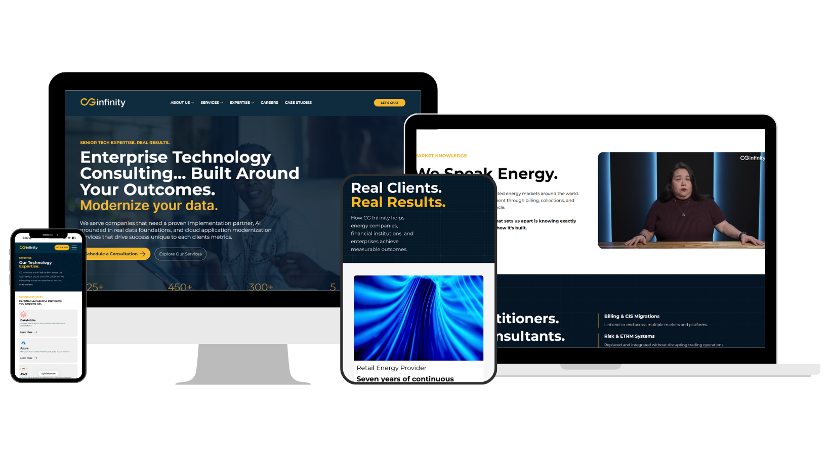
Behind every line of code at CG Infinity is someone who understands what is at stake. The site was reimagined to bring those people—and the years of industry knowledge they carry—to the surface. A sharper visual system and clearer path through the content turned a catalogue of capabilities into something more alive: a portrait of a consultancy built by people who understand both the technology and the world it has to work in.
My Contribution
RoleWeb Strategy & Design
FocusUX, Content Architecture, Messaging, Visual Direction
PlatformWix Studio
Group Event Offerings
Best Deal
Advance Together: Our Collective Learning Series
We coordinate all fundamental components, empowering participants to focus entirely on learning, networking, and measurable outcomes.
Streamlined Navigation
The desktop site’s broad service and expertise structure was reorganized into a compact mobile menu with clearer groupings. Visitors can move between capabilities, industries, and company information without losing their place
Responsive Hierarchy
Pages were restructured for smaller screens rather than simply scaled down. Headlines, supporting context, proof points, and calls to action appear in a deliberate order that keeps the story easy to follow.
Scannable Content
Dense technical information was divided into shorter content blocks, capability cards, and high-impact statistics. More breathing room between sections helps visitors understand the work without being met by a wall of text.
Touch-Friendly Interaction
Buttons, links, and navigation controls were given enough size and separation to feel natural on a touchscreen. Calls to action remain easy to find throughout longer pages, ensuring each path leads somewhere useful.
From Capabilities to Credibility
CG had decades of experience, measurable client wins, and consultants who knew their industries from the inside—but the former WordPress site scattered that story across crowded service categories and generic imagery. The redesign brought the signal through the noise: creating clearer paths through the company’s expertise, putting its people and perspectives at the center, and connecting technical capability to proof of real business impact.
Before
Seven service categories competing for attention
Industries and technologies separated into different buckets
Broad consultancy language
Generic industry and stock imagery
Capabilities explained mostly through description
“People First” lived largely in the tagline
After
Three clearer entry points: Data & AI, Salesforce, and Cloud
Expertise organized around how clients actually look for help
Messaging grounded in real problems, stakes, and outcomes
Real CG employees, leaders, and practitioners
Credibility built through credentials, case studies, and measurable results
People and firsthand industry knowledge made visible throughout the site