Haider’s Paws Forward
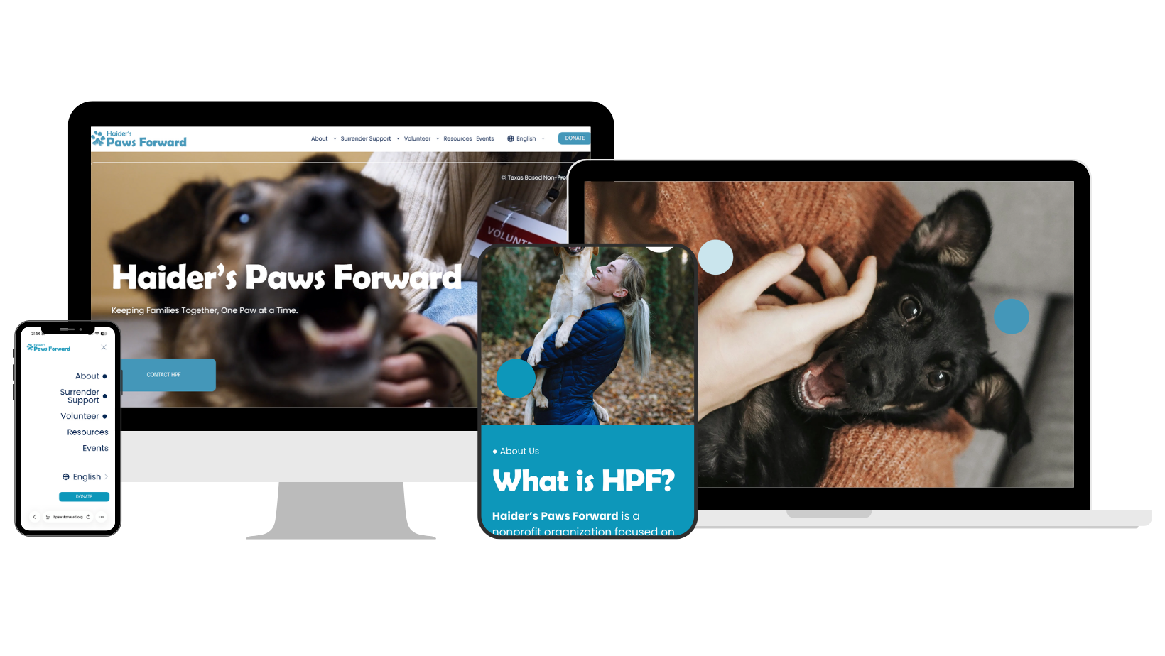
This amazing nonprofit called for a digital identity as personal as the mission behind it. The brand and website were built around the actual paw print of Haider, the founder’s late dog, carrying his memory from the logo into subtle, paw-inspired details throughout the experience. Warm, hopeful, and deeply human, the design honors the bond that inspired HPF while bringing its mission of keeping people and pets together through crisis to life.
The Mark He Left
As an animal lover, I came to this project with my heart already in it. I wanted the site to carry the tenderness of the story that began it without losing sight of the people arriving there in the middle of something hard. Every choice became a way of holding both: Haider’s memory in the details, and a clear path forward for the families his legacy now serves.
Haider’s legacy became the emotional foundation of the website, shaping an experience that feels compassionate, hopeful, and deeply personal. Paw-inspired details, organic forms, warm photography, and thoughtful movement carry his presence throughout the design, while clear content hierarchy and intuitive pathways guide visitors toward support, fostering, volunteering, or donating. The result transforms a deeply personal story into an accessible digital experience centered on keeping people and their pets together.
The Surrender Support journey was designed for visitors facing urgent, emotional decisions. Clear language, scannable crisis categories, and prominent application pathways help users quickly understand the support available and what to do next. By pairing reassurance with direct action, the experience turns a complex service into a compassionate, accessible path forward.
The donation interface uses clear visual hierarchy to lead visitors from the impact message directly into action. Preset giving amounts are paired with specific outcomes, turning an open-ended decision into a scannable, low-friction experience, while a custom option preserves flexibility. Keeping the context and donation form within the same section allows visitors to act at the moment of highest intent without disrupting the journey.
The mobile experience preserves the warmth and clarity of the desktop site while restructuring content for smaller screens. Simplified navigation, readable content blocks, touch-friendly controls, and prominent support and donation pathways keep essential actions within easy reach. Rather than simply shrinking the desktop design, each screen prioritizes the information and interactions visitors need most.